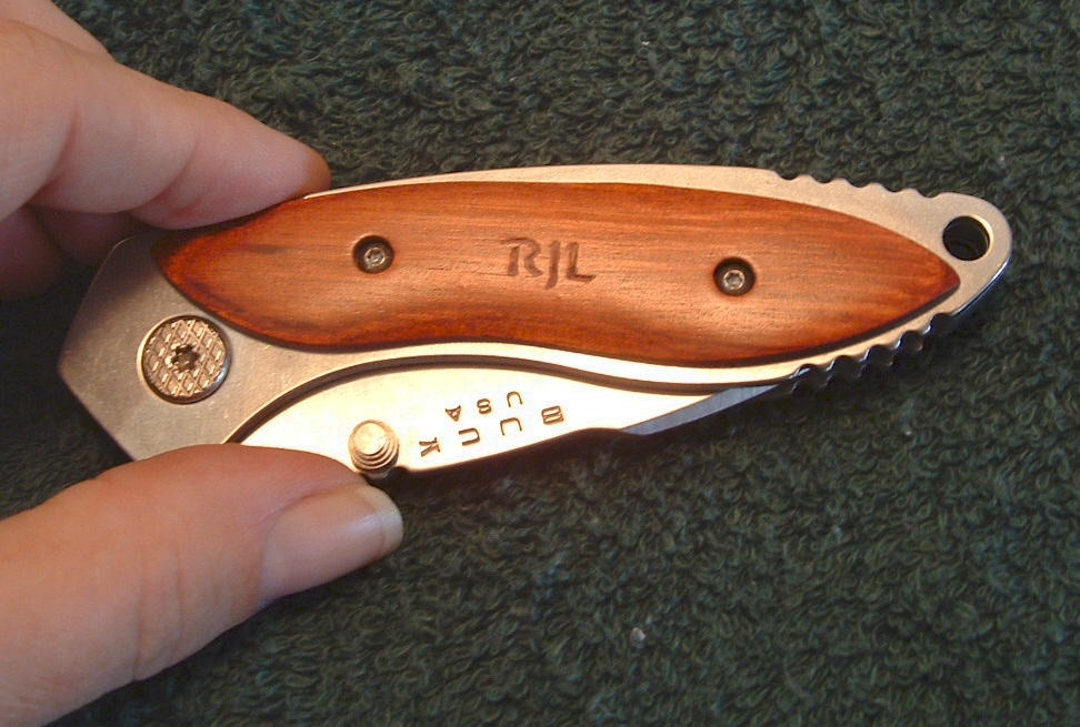
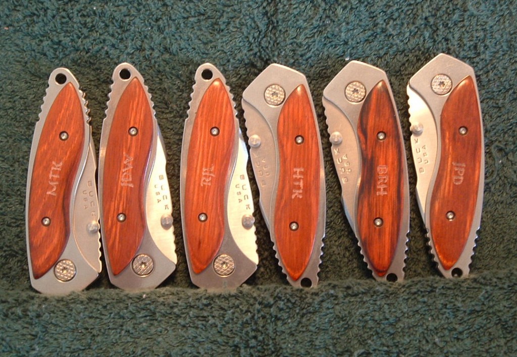
One thing most folks don’t think about much is that it’s simplicity in life that makes for a beautiful piece. Choosing the lettering fonts, determining spacing, any extras like scrolling. Is it going on the blade, or is it a handle carving?
When Matt asked me to do this, I was pleased at his font choice. Gentle strokes but bold lettering, very masculine, and with fine personality. I hope you like the work.
When I pulled out the first knife to show Matt, he was happy with it. I said, “Good, this is the one I liked the least!” So, here is a look at a set of Buck pocketknives Matt gave his groomsmen at his wedding.


3 comments on “Simple Pocketknife Monograms”